
Pavel Lupu — product designer
Case study / 01
Regulated fintech · Mobile app · 2022–2025

Designing and growing a regulated investing app

Sole designer at a seed-stage European fintech building a UCITS investing platform for retail investors.

Role
Lead designer
+ Product lead (2024–25)
Team
~20 people
Duration
Jun 2022 → Feb 2025
~3 years
Scope
Mobile app, end-to-end

Joined pre-launch as the first designer. Shipped the core flows — KYC, wallet, orders, account recovery — then led the post-launch effort to figure out why conversion was lagging.

Set up analytics, built a customer-feedback loop into onboarding, ran experiments on incentives, referrals, and friction. Some moved the needle, some didn't. The honest takeaway: for low-urgency products, design can fix friction but it can't manufacture urgency.

Designing & growing a regulated investing app
01Phase one · Getting to launch

Ship the missing pieces, launch a regulated app.

The app had a working investment engine. Most user-facing flows were either missing or in rough shape. The team had a launch target, a regulated product, and no designer.

1.1 / ScopeThe launch flows I owned

Every screen from install to first investment, designed against three audiences at once: retail users, the compliance team, and the regulatory framework itself.

Sign up
Account creation, email verification, entry into onboarding.
KYC
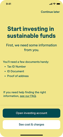
Identity verification, document upload, proof of address, suitability questionnaires.
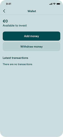
Wallet
Funding, withdrawals, balance states, transaction history.
Buy flow
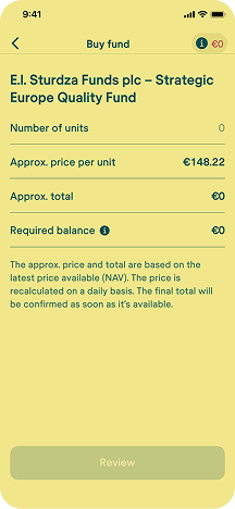
Fund selection, order confirmation, settlement windows, minimum amounts.
Portfolio
Holdings overview, performance, per-fund detail.
Explore
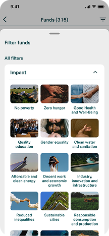
Fund discovery across the catalog, including filters for Article 8 and 9.
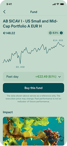
Fund page
The most information-dense screen — disclosures, performance data, call to invest.
Recovery
Password reset, email change, locked-account flows.
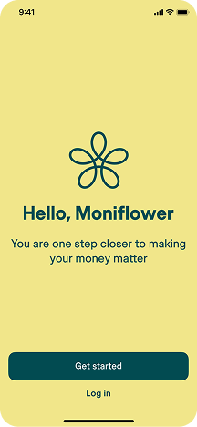
Sign up screen
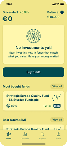
Homepage screen
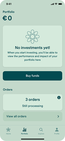
Portfolio empty state
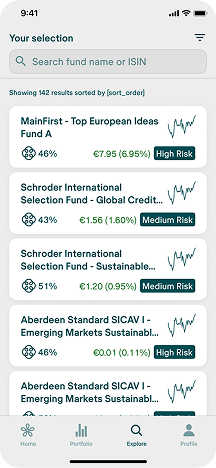
Explore funds
Explore filters
Fund page
Start KYC
Buy fund flow
Wallet
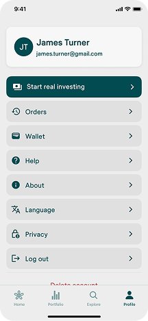
Profile

1.2 / ResearchUsability testing, as a loop

From week one, I ran testing as a continuous loop, not a one-off check before launch. Every major flow went through at least two rounds with real beta users.

After each round: short written findings, then a design sprint with PM, engineering, and compliance in the same room. Then we tested again.

Impact effort matrix used after usability testing findings
one of the impact efforts matrices after a usability-testing findings

1.3 / ValidationA virtual investing beta, before real money

Before shipping to the public market, we ran a closed beta with a virtual-investing version — real users from our close network, investing simulated money.

The goal was to de-risk launch. A regulated investing product has a high floor of things that must work — order flow, portfolio math, disclosures, edge states — and we didn't want the first stress test to happen once real euros were on the line.

We invited a cohort from our close network and ran the full journey end-to-end: sign up, onboarding, fund discovery, placing orders, checking the portfolio. Behind the scenes, orders were simulated instead of routed to market. Everything the user saw was real.

I plugged this cohort into the same usability-testing loop already running on each flow. The signal quality was significantly higher than isolated lab tests — users were living inside the product over days, not minutes.

What we got out of it: functional validation of the core flows, a sharper read on where onboarding friction actually hurt, and a list of edge cases and copy issues we could fix before real-money launch. By the time we flipped the switch to production, the app wasn't a launch — it was a promotion.

1.4 / StrategyKilling the web version at launch

When I joined, the team had been building a web version in parallel with the mobile app, and development had actually moved further on web than on mobile. By launch planning, we were effectively splitting effort across two products while the mobile experience — where our users were most likely to convert — was still behind.

The web version was absorbing engineering capacity. I pushed — repeatedly — to drop it from the launch scope. We agreed.

Our target users were mobile-first. The product was designed around a mobile-first funnel. Shipping both a mobile app and a web version was dragging development out with no clear user-value argument for the web product.

Freed up weeks of engineering time. The version we took to market was actually polished, instead of half-finished across two platforms.

It was the first of several moments where my role blurred from "designer" into product strategy.

1.5 / LaunchLaunch day, and the target we missed

We shipped to a real market moment — press, a spike, a team that felt it. Then the spike settled and a different number started becoming visible.

The launch ran alongside a 0-fees campaign — every trade placed during the first month was free. It gave the launch a hook and gave the acquisition team something concrete to put in ads and PR.

On launch day, the app shipped. The press covered it — including Luxembourg's leading business publication. The CEO ran back-to-back interviews. App store downloads spiked. For about two weeks, the numbers looked like the start of something.

Then the spike settled. And underneath, a different number started becoming visible.

First-time downloads index, after launch

Monthly · iOS · Mar–Aug 2024 · Launch month = 100
Indexed to launch month (=100): volume dropped to 42 by April, showed a temporary paid-campaign bump to 107 in June, then settled in the high-30s/low-40s range. The shape mattered more than the absolute count: launch attention was real, but baseline demand stayed low.
Annual acquisition target
Index 100
internal target (normalized)
By early Q2
Low single digits
of annual target (indexed)
only a minority of approved users placed an order
A lesson in the gap between launch enthusiasm and real traction.

The launch spike bought us attention and early volume. Without it, we'd have been dead in the water. But even with that lift, by early Q2 progress toward the annual target was still in the low single digits (indexed), and only a minority of approved users went on to place an order — clear signal that traction wasn't where it needed to be.

Some figures are indexed or range-based due to confidentiality; directional relationships are preserved.

End of Phase one · Begin Phase two
The app was live. Now we had to figure out why no one was using it.
02 Phase two · What happened after launch

The app worked. What we didn't have was traction.

We knew how far below target we were. What we didn't know was why — whether it was a marketing problem, a product problem, or something bigger. Over the months that followed, figuring out which one it was became the most interesting design work I'd ever done.

During this stretch my role expanded beyond design — I was also making product, customer care, and marketing calls. What follows is the work from that expanded remit.

2.1 / DiagnosticSetting up the instruments

We had intuitions. We didn't have numbers. Before we could run any experiments, I needed to make the funnel visible.

I defined the KPIs around the core stages of the user journey, set them up in our analytics stack, and built a reporting cadence that surfaced them to the management team on a regular rhythm.

For the first time, we could see the funnel shape clearly. It was blunt.

The funnel shape

% of app downloads · normalized
App downloadsTop of funnel
100%
Tapped "Get started"Strong top-of-funnel intent
60%
Wall 1 15% conversion between "get started" and light-onboarded
Light onboardedAccount + consent, no investment account yet
9%
Wall 2 11% conversion between light-onboarded and KYC approved
KYC approvedFully regulated investor
~1%
Wallet funded60% of KYC'd users
0.6%
First order placed87% of funded users
0.5%
~80%
Android users
~20%
iOS users

Most of our users were on Android. That mattered, because a lot of fintech design assumes an iPhone audience by default. We had to design for the phones our users actually had — often older, smaller, slower — and that shaped a lot of decisions downstream.

2.2 / ResearchTalking to users, not just measuring them

Analytics told us where the walls were. It didn't tell us what they were made of.

Our CEO proposed collecting phone numbers during onboarding — not as a gate, but as an option — so we could call users afterwards and ask what was going on. I led the program: designed the phone-number capture flow, prepped the team on how to run the calls, collected the data, and brought the insights back into product decisions.

It turned into a company-wide effort: people across the team, not just research, got on calls with real users to ask why they installed, why they stopped, what they'd want instead.

UCITS funds are not urgent products. There's no FOMO. No one installs a UCITS app and thinks "I need to invest this afternoon before the market moves."

That reframed both walls. The first wall wasn't a UX problem — it was a commitment problem. Users had tapped "get started" out of curiosity, not conviction.

The second wall was partly UX (KYC is objectively a slog), but mostly the same commitment problem at a higher cost. People who weren't in a hurry to invest weren't in a hurry to upload their passport either.

2.3 / IterationThe experiments

Over the following months, a series of experiments aimed at creating urgency, reducing friction, or changing the economics of the first investment.

To address Wall 1, we redesigned the first onboarding screens to clearly communicate the product's value before asking for commitment. We tested multiple variants of the benefits narrative and tracked which sequence moved more users from "get started" into light onboarding.

Before Original onboarding
After Redesigned flow

This benefits walkthrough was built as an early intervention to move Wall 1. We tested different value-framing variants in the first screens after "get started" to increase the share of users who continued into light onboarding instead of dropping at curiosity stage.

01Step 1
02Step 2
03Step 3
04Step 4
05Step 5

2.4 / ConclusionThe honest conclusion

We could improve the funnel. We could close the gaps. But we couldn't manufacture urgency around a product that fundamentally didn't have it.

The core thesis — that retail investors would enthusiastically onboard into UCITS funds through a mobile app — was running into a market reality we hadn't fully priced in.

Uncomfortable for a product team to reach. But the right conclusion to name.
What I took from it

Four things I now carry into every engagement.

i.

Product-market fit beats funnel optimization.

Design can remove friction. If the product itself doesn't create pull, no amount of onboarding polish will manufacture demand. Naming that out loud — as a designer, to the management team — was one of the most valuable contributions I made.

ii.

A feedback loop is the highest-leverage early investment.

Collecting phone numbers in onboarding, running a company-wide user-calling program, and feeding what we heard back into design decisions — that loop taught us more in two months than any amount of analytics would have on its own.

iii.

Owning the full loop removes weeks of latency.

Most of what I did here wouldn't traditionally sit on a designer's plate. But in a small team, the person closest to the user should be the one measuring — and the person measuring should be the one designing the next iteration.

iv.

Regulated products demand a different kind of judgment.

Every decision in KYC, disclosures, and order flows had to satisfy both the user and the regulator. That's a constraint — but also a discipline, and it made me a sharper designer than I was before.

My role

End-to-end ownership
  • Sole designer, across mobile app and supporting web surfaces.
  • Designed and shipped every user-facing flow: sign up, KYC, wallet, buy flow, portfolio, explore, fund pages, account recovery.
  • Ran continuous usability testing with beta users; wrote up findings; facilitated design sprints with PM, engineering, and compliance.
  • Defined and set up KPI analytics on the full funnel; reported to the management team.
  • Led the post-launch customer feedback program (initiated by our CEO) — designed the phone-number capture flow, prepped the team, collected and synthesized the data, fed insights back into product.
  • Designed and analyzed post-launch experiments: incentives, referrals, no-fees windows, onboarding redesign.
  • Pushed for — and won — the strategic decision to drop the web version from launch scope to protect mobile quality.
Tools: Figma · Zeplin · Jira · Analytics stack

Building an early-stage product and want someone who'll own the full loop?

Design, research, analytics, iteration — I'd love to hear about what you're working on.